
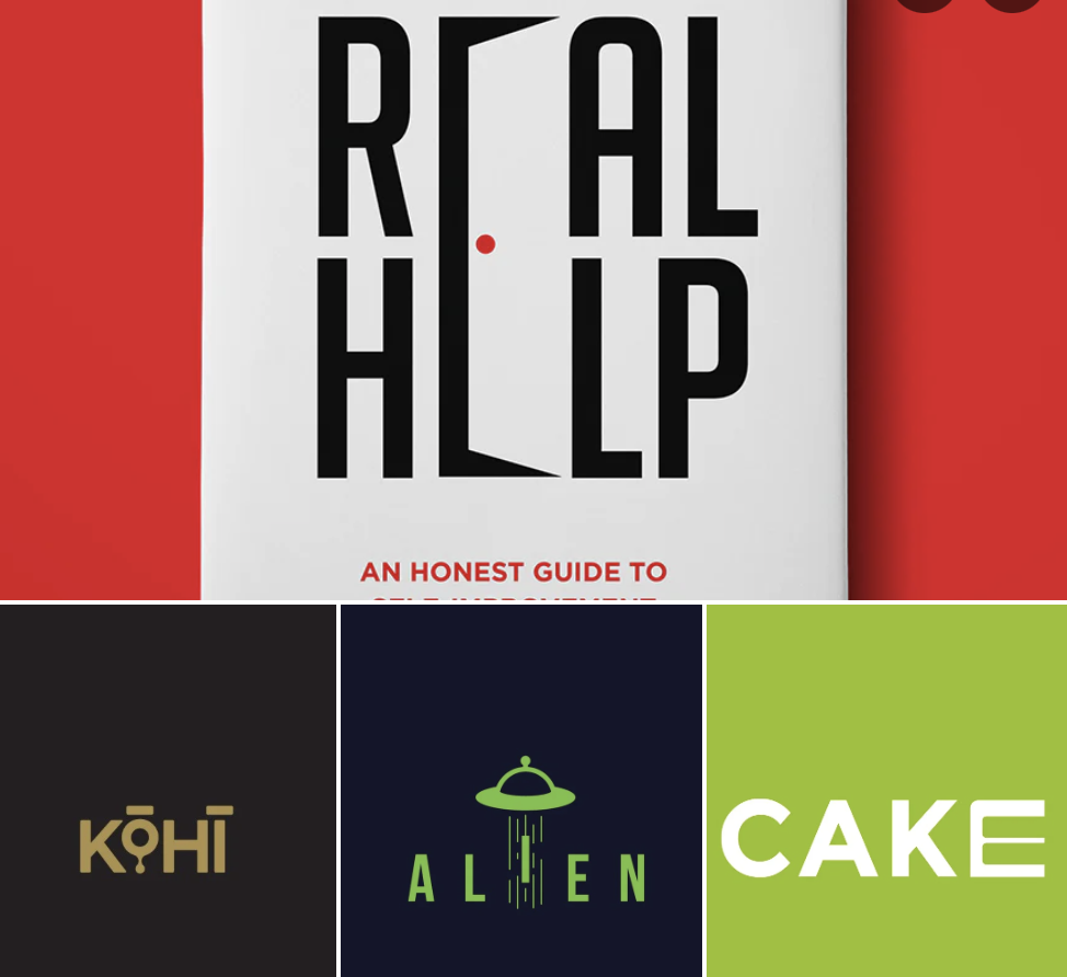
For better or worse, most typography is designed to fade to the background. While this may come across as dull, it’s what allows letters to read well, putting the meaning of the words ahead of the designer’s ego. Typically, “fonts” achieve this through a predictably uniform style, but in 2021, I have been seeing wordmarks with individual letters that stand out from the rest.
www.calendly.com/agencybel/30min
If you would like your logo word mark to stand out above the fray, let’s set up a free strategy call to discuss!
www.calendly.com/agencybel/30min
#graphicdesign
#logo
#logodesign
#brandidentity
#branding
#creative
#brand
#marketing
#typographydesign
#strategy
#digitalmarketing