Santander Global Advisors Brochure

Client: Santander Global Advisors, Financial Services
Project Overview:
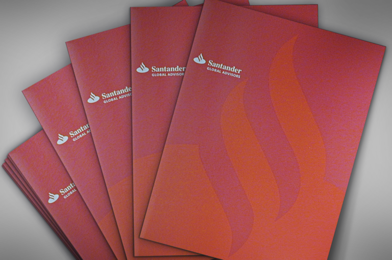
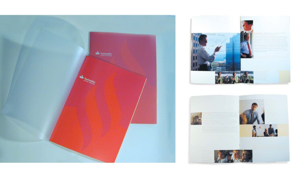
Years ago, Santander, a Spanish bank, was launching its global advisory group in Boston. At that time, Santander was relatively unknown in the U.S. market. Agency BEL was brought on to create an introductory brochure that would reflect the entrepreneurial and visionary flair of Santander Global Advisors. The project involved developing a dynamic print campaign that emphasized the distinctive red color of the company logo, a bold move in the traditionally blue-hued financial industry.
Objectives:
- Create an introductory brochure that reflects the entrepreneurial and visionary spirit of Santander Global Advisors.
- Utilize the dynamic red color of Santander’s logo to differentiate the brand from its competitors.
- Develop a print campaign that positions Santander Global Advisors as a forward-thinking and innovative financial services provider.
Strategy:
1. Brand Positioning:
- Positioned Santander Global Advisors as a dynamic and visionary offshoot of the Latin American bank.
- Emphasized the company’s entrepreneurial spirit and commitment to innovation.
2. Brochure Design:
- Designed a brochure with a plastic cover and bold red color scheme to stand out from the traditionally blue palettes of competitors.
- Used high-quality materials and striking visuals to convey the brand’s premium positioning.
3. Visual Identity:
- Incorporated Santander’s distinctive red color to create a strong and memorable visual identity.
- Ensured the design elements reflected the company’s commitment to innovation and forward-thinking approach.
Execution:
Laura Sauter, with her extensive experience in branding and design, led the project. The team focused on creating a brochure that would not only introduce Santander Global Advisors to the U.S. market but also establish a strong and distinctive brand presence.
Results:
- Enhanced Brand Visibility: The bold design and use of Santander’s red color helped the brochure stand out and capture attention in a crowded market.
- Successful Market Introduction: The introductory brochure effectively communicated the entrepreneurial and visionary spirit of Santander Global Advisors, helping to establish the brand in the U.S. market.
- Differentiation from Competitors: The dynamic red color and innovative design set Santander Global Advisors apart from the traditionally blue-hued financial industry.
Conclusion:
The Santander Global Advisors brochure project successfully introduced the brand to the U.S. market, leveraging bold design and strategic positioning to differentiate it from competitors. The use of Santander’s distinctive red color helped create a strong and memorable brand presence, reflecting the company’s entrepreneurial and visionary spirit.
Need an innovative print piece for your business? Let’s Chat!
This case study demonstrates how bold design and strategic positioning can successfully introduce a brand to a new market, driving differentiation and building long-term brand equity. At AgencyBEL, we are committed to empowering financial services firms through strategic and impactful branding solutions.
Financial services brochure
Santander Global Advisors
AgencyBEL branding project
Bold red color scheme
Innovative brochure design
Financial industry branding
Entrepreneurial brand positioning
High-quality print materials
Dynamic visual identity
Market introduction campaign

