Why does color really matter, and how does it shape brands?
It’s impossible to imagine Coca-Cola without picturing the swirling red logo, or to think about McDonald’s without visualizing its signature yellow arches. So why does color really matter, and how does it shape brands?
As the first thing people notice, it can’t be overstated how important color is for establishing a visual identity. From increasing brand recognition by up to 80 percent, to influencing mood and perception, it’s important that businesses consider the psychological impacts that colour can have on potential customers.
1. Audience Recognition
You’ve probably seen quite a few bike-sharing companies appear in your city over the last few years. In many cities there are at least four operating brands. But how many can you truly name? For most people, the bike sharing apps are all about color; red, green, blue, orange – which one do you use? The more green bikes that people see, the more likely they will be to remember the green brand, and therefore the more likely they are to download the green-brand’s app. Color is linked to memory and recognition, and is often far easier to recall than a name, especially if it has only been seen once.


2. Mood
Research shows that color can significantly influence consumer mood. For instance, you may be aware of the theory that McDonald’s signature yellow arches on the red background were specifically chosen to trigger feelings of hunger. While this hasn’t been proven, red has been linked to increasing excitement and heart rates – which could potentially increase appetites. Harnessing the interesting psychological effects of colour can be used to create feelings in potential consumers, such as trust or engagement, which can help to encourage interest in your product from your target consumer market.
3. Perception
Fun? Innovative? Serious? Different colors reflect different things and depending on which one(s) are chose to represent a brand, they can significantly affect how customer’s perceptions are shaped. Whether businesses opt for exciting red or competent blue, each color is bound to elicit a reaction in your consumers. The use of certain colors by certain brands – such as “competent” blue by KPMG, or “exciting” red by Coca-Cola – has unconsciously solidified this in consumer minds.
4. Consistent Branding
Choosing and sticking to a color theme is important to developing a consistent brand. But why is this crucial? A consistent brand is important to ensure that potential customers don’t receive mixed messages. If a brand uses bright colors and an exciting tone of voice to engage with young audiences, but then shifts to a more serious and business color and tone, audiences are going to become confused and consequently disengaged. Notice how social networking sites like LinkedIn keep their colour and tone consistent across every page.

5. Logos
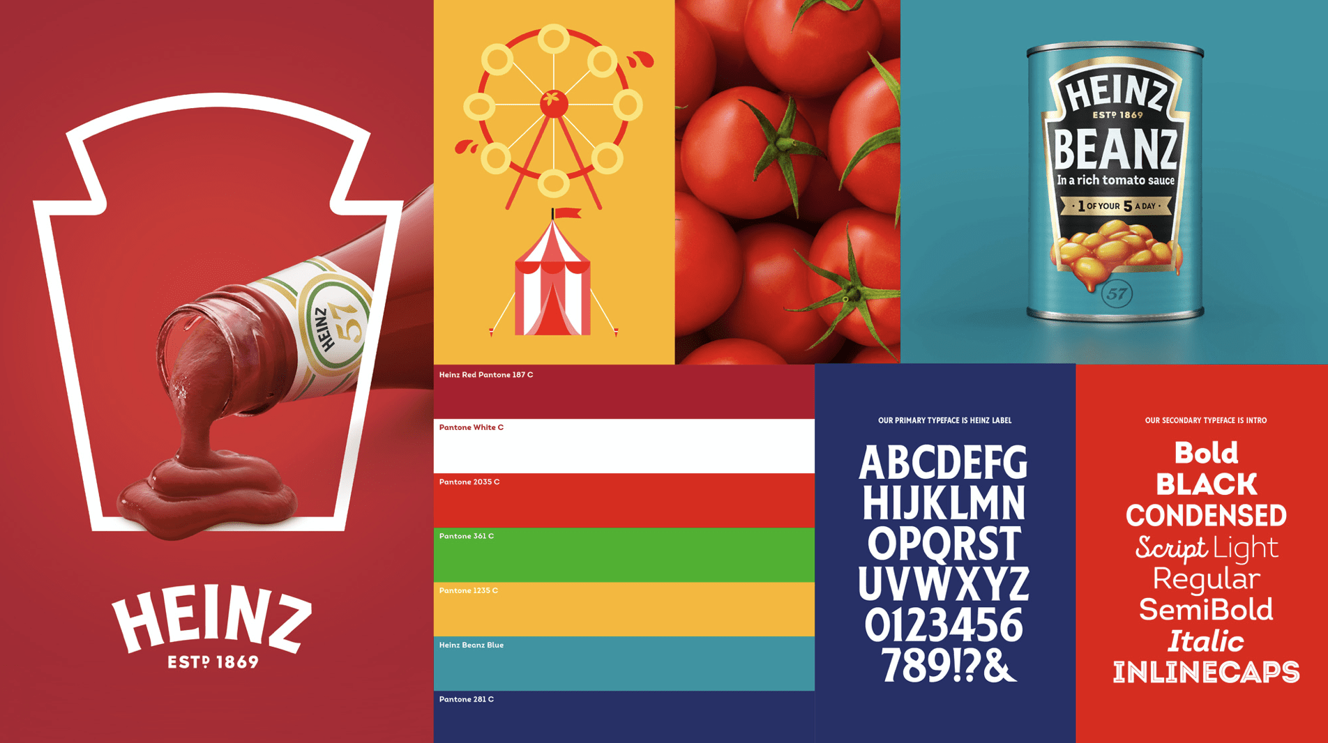
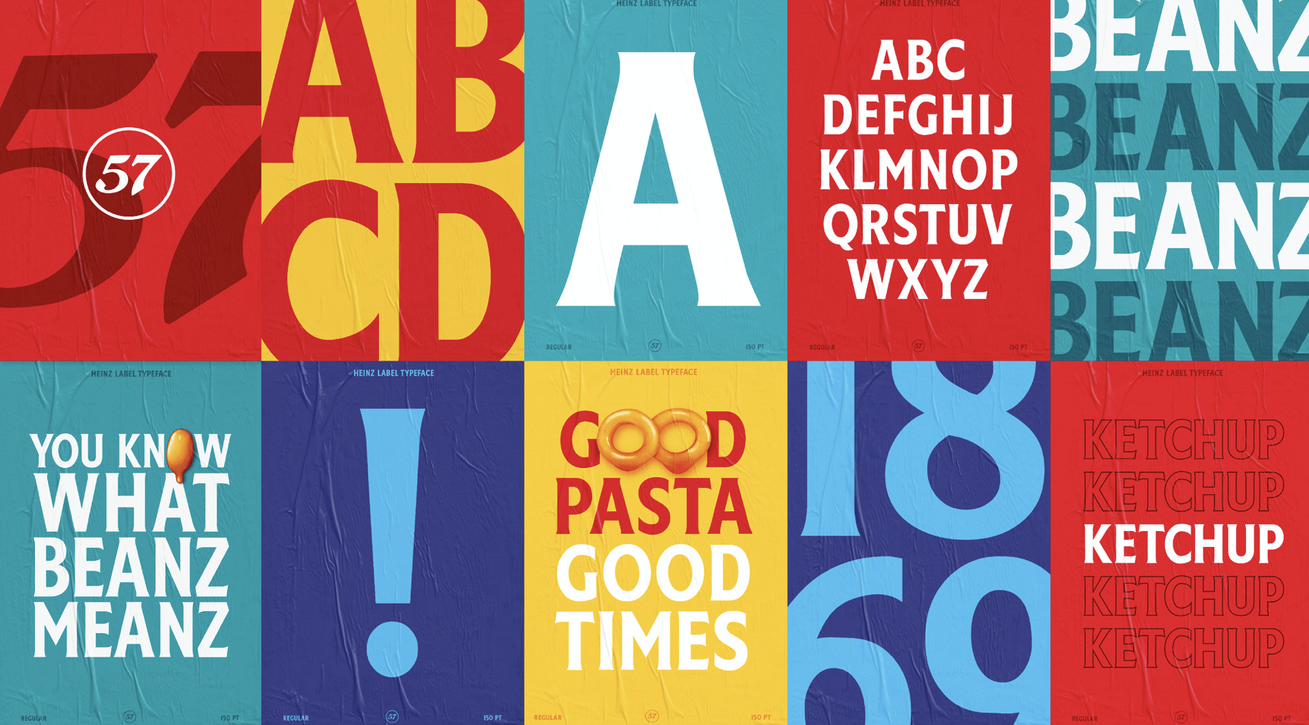
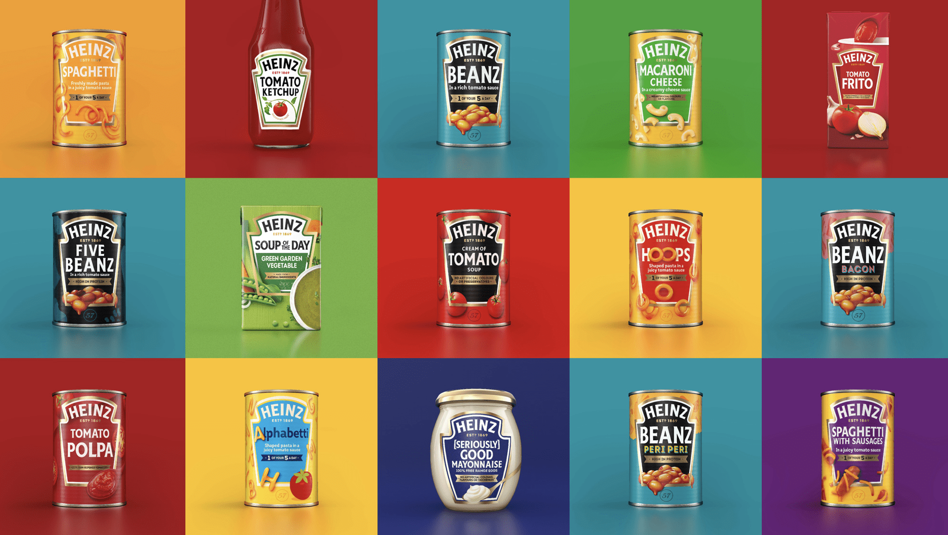
It’s important to consider how colour is used in logos. Most designers agree that no more than three colours should be used in a logo, often with the rule of a 60/30/10 percent split. More colours can make the logo appear messy and less striking, while less can help a brand stand out. Take a look at some of Unilever’s subsidiary brands – some of the most well-known and highly consumed in the world – and notice that the majority of the brand logos have one thing in common: they use three or less colours.
6. Do Consumers Really Like Us?
It might sound ridiculous, but the answer to this question may depend on your business’s use of color. Research suggests that over 90% of people put the most importance on visual factors when purchasing a product, while between 60% – 90% of a person’s initial judgement of a product is based on color alone. Still think it’s crazy? Try comparing this uniform with this one – you be the judge of which team you like better.
————
If you have a burning question about your brand and would love to pick our brains for half an hour, you can book a consultation here.
To find out more please visit my portfolio.