A logo is one of the visual elements within a brand strategy that plays an important role in attracting customers to a brand.
It creates the initial appeal that sets the tone for how a brand is expressed and experienced.
As the old adage goes, “A logo is not a brand”, though the logo plays a vital role in attracting attention and increasing the memorability of a brand.
And evoking that memorability and recognition is the primary role of the logo.
There are no hard and fast rules when it comes to the types of logos brands can consider when setting out or rebranding.
However, choosing the correct type of logo is important in appealing visually to your audience and increasing the chances of being remembered in the buying decision.
Great logos tell great stories, and that’s why your brand strategy should be the foundational pillar on which your logo is designed.
It’s worth noting that a single logo can fall under more than one category mentioned below.
9 Different Types Of Logos For Brand-Building With Examples
#1. Brand Marks or Pictorial Marks

Also known as logo symbols or brand icons, brand marks are made of a graphic symbol or icon that reflects a brand’s identity or what it does.
When you see such symbols, you can easily match the logo with the brand that owns them.
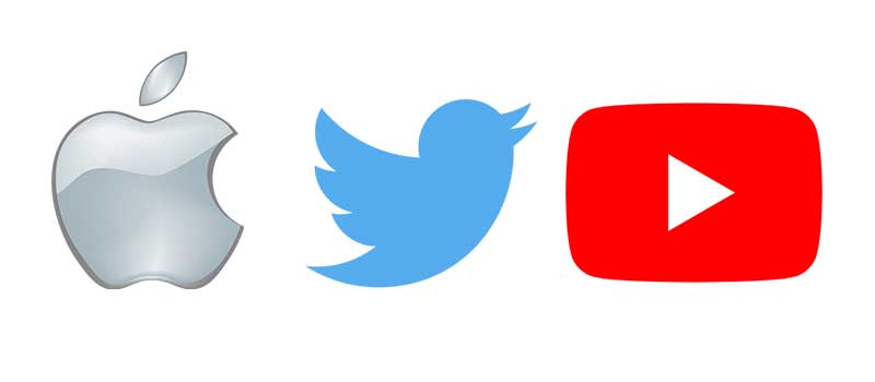
For example, Apple’s logo is an apple while Twitter’s logo is a bird. Other examples include Target, Shell, Instagram, and Youtube.
A pictorial mark can be used as a literal representation of your brand name and main business activity or to cleverly project your brand values.
For instance, Apple’s logo literally represents its brand name while the YouTube logo depicts a video play button to represent the video service they provide.
When To Use Brand Marks:

If you are a new company that’s currently at the brand recognition stage, it can be tricky to use a brand mark. This is because it can take a lot of time and effort to get people to associate the image with your brand.
However, if you decide to use this type of logo, one of the major considerations is the image to choose and its implication on your brand.
If you want to use a brand mark, your business must be into something that is quite related to the image or symbol you want to use.
If choosing a brand mark or pictorial mark for your logo, ensure there’s direct or abstract alignment to products or services the brand offers.
Brand marks are a good choice for brands that specialize in one product or service that can be easily represented by an image.
#2. Wordmark Logos
A wordmark logo is essentially a type-based logo.
Brands use strong typography to create logos that use their business name to express their brand identity.
They are some of the most versatile logotypes as they are easily transferable to a variety of marketing materials.
If your company has a business name that is succinct, distinctive, and memorable, you can try the wordmark logo to create strong brand recognition.
For a wordmark logo to be effective, the choice of typography and its characteristics must align with the strategy and attributes of the brand.
For example, a brand that aims to celebrate its long-standing heritage might do well to consider a more traditional type from a relative period.
If we don’t find an existing font to align with the look and feel you aim to achieve, we can create a custom typeface, which would add to the uniqueness of the wordmark.
Examples of brands that use wordmarks are Coca-Cola, Uber, Tiffany & Co, Subway, Kellogg’s, eBay, etc.
When To Use Wordmark Logos:
A wordmark logo is a great choice if you’re just a startup and you want to increase the memorability of your business name.
#3. Abstract Logo Marks
Abstract logo marks are the type of pictorial logo that does not have a recognizable image.
They are usually abstract geometric forms that are custom-made for a brand to express its uniqueness.
One advantage of this type of logo is that it gives brands enough room to design and create a logo that showcases and communicates their brand personality, values, and core message.
Some popular companies using abstract logo marks are Microsoft, Pepsi, Adidas, Nike, and Airbnb.
When To Use Abstract Logo Marks:
An abstract mark logo is a good option for brands that are into several distinct things, especially when you are more interested in communicating unique brand values that set your business apart.
However, when creating an abstract logo, you must keep refining it until it gets to the point where you’re convinced it’s communicating your intended message.
If not properly done, an abstract logo mark can become either too vague or too complex to understand.
#4. Mascots
In mascot logos, brands use illustrated characters as visual representations of their brands.
Such characters can be fictitious or real people that are usually referred to as a brand’s “spokesperson” or “ambassador”.
The characters used in Mascots can be an excellent tool for customer interaction within marketing campaigns or throughout the brand experience.
Examples of Mascot logos are KFC, Comparethemarket.com , Pringles, Geico, and Mailchimp
When To Use Mascots:
Mascots are a great way to add personality to a brand and to enable the embodiment of the brand’s attributes though this logotype doesn’t suit all brands.
Only brands that want to communicate a light-hearted approach should play in this space.
If your brand brings an element of fun into the lives of your audience or you simply want to communicate you’re light-hearted approach, a mascot logo could work for you.
#5. Combination Marks
These types of logos combine a pictorial mark logo, an abstract mark logo, or a mascot with a letter mark or word mark.
They also come in different forms; the picture and text can be stacked side-by-side, or integrated together to create an image.
The combination mark is a flexible and obvious choice most businesses because combining text and icons can help communicate different ideas and attributes
It makes it easy for people to associate your brand name with the pictorial mark while the combined wordmark reinforces the associationas and increases memorability.
Examples of companies using the combination mark logos are La Coste, Burger King, Addidas, Channel, Mercedes-Benz.
When To Use Combination Marks:
Combination marks are a great choice for new brands with little awareness as the multiple elements allows for business and brand associations as well as a variety of attributes through colour, typography and shapes.
As customers come in contact with your logo, they have multiple visual cues both from the pictorial mark and letter mark and this helps them to remember your brand.
#6. Emblem Logos
Emblems are crests, badges, and seals used by brands to promote their traditional values.
Emblem logos are designed by placing fonts in icons to provide unique logos.
Famous brands using this logotype include Starbucks, Harley-Davidson, BMW, Juventus and Volkswagen.
When To Use Emblem Logos:
Organizations like schools, government agencies, sports clubs, the auto industry, and brands with long traditions use this type of logo.
If you want to communicate a sense of tradition or high standard, the emblem logo may be a legitimate option.
As a bonus tip, keep your emblem logo as simple as possible to avoid clutter. Remember, the primary job of the logo is memorability.
#7. Dynamic Marks
As the name implies, dynamic mark logos are created in different forms so they can easily be adapted to different branches or segments of a brand.
For each of the forms, an element of the logo changes, this may be the color, text, shape, or icon.
Examples of companies using dynamic marks are FedEx, Google, Nickelodeon, and Virgin.
When To Use Dynamic Marks:
This type of logo is suitable for brands interacting with customers across several touchpoints such as mobile sites, responsive webpages, digital media, merchandise, traditional media, ads, etc.
It’s also a viable option for a branded house setup where the parent brand has a brand portfolio of brands serving different markets such as FedEx and Virgin,
Through dynamic marks are flexible by nature, it’s key to keep an element of consistency across the board so the logo variations are aligned.
#8. Lettermarks or Monograms
Lettermarks logos are created using the letters of a brand’s initials.
Think of brands like International Business Machines (IBM), Cable News Network (CNN), Hewlett Packard (HP), and Life’s Good (LG).
In most cases, the majority of the market doesn’t know the real names of the brands, and only identifies them by their initials.
You may not know a company named Bayerische Motoren Werke GmbH but no doubt you know the brand BMW.
That’s what letter marks help companies achieve. In letter marks, brands use elegant custom fonts to convey their brand identity.
When To Use Lettermarks:
If you have a lengthy business name, initialism can help you to make the name shorted and easier to say or pronounce.
A lettermark logo is certainly one of the best options for such brands.
That said, initialism as a naming strategy is not always the best option and concedes opportunities to make connections and assign meaning to what the brand does or what it represents.
#9. Letter Forms
Letterforms are one-letter logos, a miniature version of lettermarks.
The letter in the logo is usually the first letter of a company’s name.
Sometimes, companies create this type of logo as a complement to an existing logo and as a supplement or team player in the overall brand identity.
Successful letter forms however, can go on to become the preferred choice of logo use over time as it becomes more recognized
Examples of brands using letter forms are Netflix, McDonald’s, and Facebook.
When To Use Letter Forms:
If you are a brand that’s already popular, you can create a letterform logo for your brand.
However, remember to make it a memorable one.
If your brand has high levels of awareness, intorducing a letterform mark may help to increase levels of brand recognition and recall.
