Louis Di Calla Fine Lighting

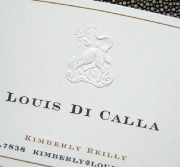
Louis Di Calla Logo

The branding of Louis Di Calla successfully transformed the company’s identity, aligning it with its dedication to luxury and fine craftsmanship. By leveraging comprehensive branding strategies and creative design, Agency BEL helped Louis Di Calla establish itself as a leader in modern lighting design.

Luxury lighting design branding
High-end collateral system
Louis Di Calla case study
AgencyBEL branding project
Custom photography for luxury brands
Modern lighting design
Branding for design centers
High-end marketing materials
Luxury brand positioning
Elegant logo design

Granite Financial Partners Rebrand

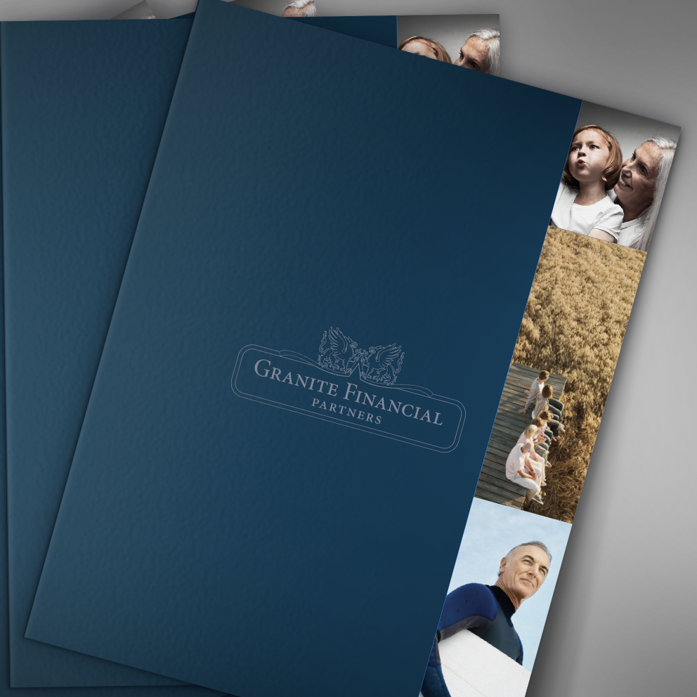
The rebranding of Granite Financial Partners successfully transformed the firm’s identity, aligning it with its commitment to personalized financial services. By leveraging strategic research, creative design, and targeted marketing, Agency BEL helped Granite Financial Partners establish a modern and cohesive brand that resonates with clients and positions the firm for future growth.

Financial services branding
Logo modernization
Granite Financial Partners case study
AgencyBEL branding project
Family-run business rebrand
Professional financial services
Custom marketing collateral
New Hampshire financial firm
Strategic rebranding
Personalized financial planning

Coopers and Lybrand Centennial Logo

Centennial logo design Professional services branding Coopers & Lybrand centennial Commemorative book design Corporate anniversary branding PwC brand history Strategic messaging Market re-engagement Legacy and innovation branding AgencyBEL branding project

Coopers and Lybrand Centennial Logo Client: Coopers & Lybrand (now PricewaterhouseCoopers – PwC),  Professional Services Project Overview: In celebration of their 100th anniversary, Coopers & Lybrand sought to create a centennial logo, commemorative book, and website to highlight their history and commitment to the future. Although the company did not undergo a technical rebrand, this […]

Wagamama Restaurant Branding

Restaurant branding Environmental graphic design Wagamama US debut AgencyBEL branding project Japanese-inspired decor Cherry blossom light wall Graphic printed shades Faneuil Hall restaurant Gensler collaboration Cultural brand adaptation

Laura Sauter, with her extensive experience in environmental graphic design, led the project. The team focused on creating a seamless blend of Wagamama’s established brand identity with design elements that would appeal to the U.S. market.
Restaurant branding
Environmental graphic design
Wagamama US debut
AgencyBEL branding project
Japanese-inspired decor
Cherry blossom light wall
Graphic printed shades
Faneuil Hall restaurant
Gensler collaboration
Cultural brand adaptation

Fidelity Investor Center Placemaking

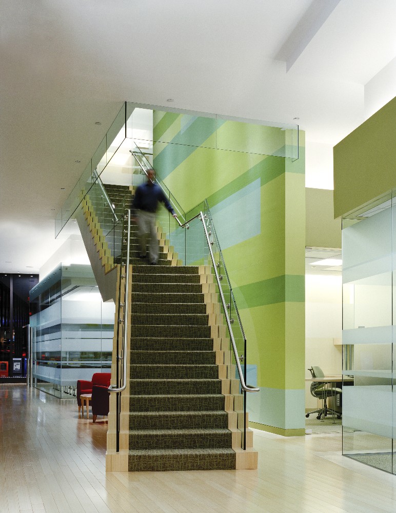
This case study demonstrates how effective environmental branding and placemaking can transform a retail space, driving customer engagement and building long-term brand equity. At AgencyBEL, we are committed to empowering brands through strategic and impactful branding solutions.

Environmental branding
Placemaking project
Fidelity Investments case study
AgencyBEL branding project
Branded environment design
Financial services branding
Retail space design
Gensler collaboration
Customer experience design
Innovative office design

She and Me Content for Women Branding

The spirit of she & me is symbolized by our new logo, which was designed to convey our strength in consulting corporate enterprises in targeting and talking to women online. The ampersand softens the boldness of the primary type, and is elegant, sophisticated, yet subtle. A hint of the feminine. To best offset the colors in the logo and build brand recognition in all communications, it is important to use the positive logo on the cream background. The reverse logo was designed to stand out against our rich blue background. This treatment makes a bold brand statement through use of color. Content strategy branding Women-focused content consulting She & Me case study AgencyBEL branding project Personal brand development Custom marketing materials Online content strategy Professional website design Targeting women online Effective web strategies

The spirit of she & me is symbolized by our new logo, which was designed to convey our strength in consulting corporate enterprises in targeting and talking to women online. The ampersand softens the boldness of the primary type, and is elegant, sophisticated, yet subtle. A hint of the feminine. To best offset the colors in the logo and build brand recognition in all communications, it is important to use the positive logo on the cream background. The reverse logo was designed to stand out against our rich
blue background. This treatment makes a bold brand statement through use of color.
Content strategy branding Women-focused content consulting

She & Me case study
AgencyBEL branding project
Personal brand development
Custom marketing materials
Online content strategy
Professional website design
Targeting women online
Effective web strategies

Kaava Technologies Brand Launch

Business insights branding Analytics company rebrand Kaava Corporation case study AgencyBEL branding project Corporate B2B website design Startup collateral materials Consumer pattern analysis Online community insights Professional logo design Brand strategy for analytics firms

Kaava Corporation’s rebranding project successfully transformed the company’s identity, aligning it with its new business model and market focus. By leveraging comprehensive branding strategies and creative design, Agency BEL helped Kaava establish itself as a pioneer in deciphering consumer patterns in online discussions.

Business insights branding
Analytics company rebrand
Kaava Corporation case study
AgencyBEL branding project
Corporate B2B website design
Startup collateral materials
Consumer pattern analysis
Online community insights
Professional logo design
Brand strategy for analytics firms

High Altitude Tennis Branding

The branding and marketing efforts for High Altitude Tennis successfully transformed the facility’s identity, aligning it with its commitment to helping players achieve their full potential. By leveraging comprehensive branding strategies and creative design, Agency BEL helped High Altitude Tennis establish a strong and engaging brand presence that resonates with clients and supports business growth.
Sports training branding
High Altitude Tennis case study
AgencyBEL branding project
Private tennis training facility
Modern logo design
Sports marketing materials
Professional website design
Tennis training programs
Athletic branding strategy
Dynamic visual identity

his case study demonstrates how effective branding and strategic design can establish a sports training facility as a leader in its field, driving client engagement and building long-term brand equity. At AgencyBEL, we are committed to empowering businesses through strategic and impactful branding solutions.

Raytheon Rebrand

Laura Sauter, with her extensive expertise in corporate identity and branding, led the project. The comprehensive approach included an initial audit, development of brand standards, creation of advertising templates, tradeshow graphics, and the establishment of a new collateral system. The project involved over 2,132 emails, 17.26 gigabytes of stored information, a new brand architecture, 104 sections to the site, 11 usage guidelines, and countless text revisions and hours of consulting.

Laura Sauter, with her extensive expertise in corporate identity and branding, led the project. The comprehensive approach included an initial audit, development of brand standards, creation of advertising templates, tradeshow graphics, and the establishment of a new collateral system. The project involved over 2,132 emails, 17.26 gigabytes of stored information, a new brand architecture, 104 sections to the site, 11 usage guidelines, and countless text revisions and hours of consulting.

Wilmington Trust Rebrand

Corporate rebranding Financial services branding Wilmington Trust case study AgencyBEL branding project Incremental rebrand strategy Modernized brand identity FutureBrand collaboration Emotional branding Brand consistency Commemorative brand materials

Wilmington Trust’s rebranding project successfully balanced the need for modernization with the emotional attachment to the existing brand. By adopting an incremental approach, the updated identity resonated with stakeholders and clients, reinforcing Wilmington Trust’s commitment to its heritage and future.

Corporate rebranding
Financial services branding
Wilmington Trust case study
AgencyBEL branding project
Incremental rebrand strategy
Modernized brand identity
FutureBrand collaboration
Emotional branding
Brand consistency
Commemorative brand materials